In the previous article, “2026 New Optical Label Series (Part 1)“, we shared seven optical label designs, demonstrating the unique visual effects brought by different optical technologies.
However, in our opinion, a good optical label is not just about technology.
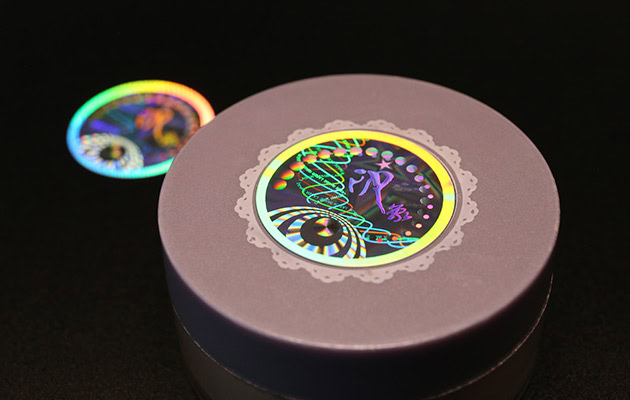
For many brands, in addition to protecting products, optical labels have also become part of packaging design. It not only helps brand anti-counterfeiting, but also conveys brand image and brings a richer visual experience.
Therefore, when designing these labels, we are not only thinking about how to improve anti-counterfeiting performance, but also thinking about how to make the labels more storytelling and more recognizable.
Today, we continue to share another seven anti-counterfeiting label designs. Some of the inspiration comes from nature and art, and some comes from our years of exploration and accumulation in the field of optical anti-counterfeiting.
Next, let’s take a look at the creativity and technology behind these designs.
1. Achromatic white – Riding the Waves
This label focuses on surfers and uses achromatic white (sand silver) as the overall background.
Under normal observation, the image presents a low-saturated grayish-white texture; when the light changes, the waves and splashing water will gradually show a flowing color effect.
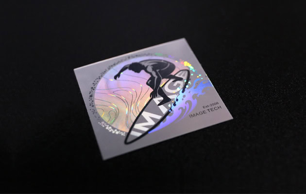
Achromatic white can also be used as a “subdued optical structure” that allows the picture to be restrained and has room for change.
The surfer also reflects our own journey over the past two decades: continually moving into new technological territory and embracing change. The flowing structural colors naturally reinforce this sense of forward momentum.
2. Phantom Effect – Galloping Horse
The square phantom label takes galloping horses and clouds as the core vision element. Phantom technology is mainly used to express constantly changing visual effects such as smoke, water waves, and light and shadow.
When the label is rotated, the cloud will change color among blue, green, and red, creating a constantly flowing visual effect as a whole.
The design of the horse has two meanings: it not only echoes the zodiac image of 2026, but also represents a state of continuous advancement, and continues the rhythm of our long-term exploration in the field of optical anti-counterfeiting.
This unpredictable optical change not only enhances visual appeal, but also increases the difficulty of copying.
3. Multi-channel Micro Text – Enamel Horse

Inspired by the enamel artwork. The picture is made up of multiple color blocks and spliced to form the image of a galloping horse. The lines are outlined using achromatic white (sand silver) technology.
At the same time, the micro text is also hidden inside, which can present different images in different viewing directions.
The matte silver background softens the overall appearance while enhancing color stability and depth.
4. Character Mutation – Success Arrives with the Horse
This is a label in the form of a postage stamp, with the seal script “馬” as the core vision and combined with information such as “HORSE”, “2026”, and “IMAGE TECH”
As the viewing angle changes, these elements present a colorful rainbow effect, very shiny.
When you move it around, you will notice「馬」in the center will change. For users, the transformation is intuitive, interactive, and easy to verify.
Character Mutation technology gives static characters the ability to change dynamically, which cannot be achieved by traditional printing.
5. Hidden Color – A New Landscape
Inspired by traditional Chinese landscape painting. Under normal viewing angles, only the outline of the mountain can be seen, but when the light shines at a certain angle, the hidden green and red will only appear.

This is the essence of Hidden Color technology: invisible at normal viewing angles, it only appears at reflection angles.
By combining traditional Eastern artistic elements with modern optical structures, the design brings classical landscape aesthetics into a new generation of security features.
6. Side-Light Readable – Lighthouse
This label demonstrates our Side-Light Readable technology. Under normal lighting, the lighthouse appears as a static image. When illuminated from approximately a 15° side angle, hidden optical structures become active.
Different sections of the lighthouse begin to glow, the beacon lights up, and the word “IMAGE” appears inside the beam.
A lighthouse symbolizes guidance, direction, and confidence.
That perfectly reflects IMAGE TECH’s vision: to become a leading brand in optical security identification for ID documents, while continuously bringing new ideas and innovation to the field of optical security.
7. Micro text – Benjamin Franklin Portrait
With the portrait of Benjamin Franklin as the core vision. This design uses high-precision micro text technology and requires 40 – 200 times magnification to read the details.
Under the magnifying glass, we can see the hidden texts (the word height is 1mm, the line width is 0.14 mm), and there is Nano text “IMAGE” (height:0.08mm) embedded in the micro text.
Franklin was chosen because he was not only a historical figure, but also closely related to the development of the early printing industry.
This design represents a bridge between traditional ink printing and today’s structural-color technology.
Images no longer rely on inks, but instead represent colors through optical microstructures, which is what we have been doing.
The seven optical labels shared above are just part of our 2026 series design.
Each design explores a different way of combining advanced optical technology with visual storytelling. Some emphasize interaction, some reveal hidden effects, and others draw inspiration from nature, art, and everyday life.
To us, an optical label is more than an anti-counterfeiting feature. It can also become part of a product’s identity—creating a richer visual experience while delivering trust, authenticity, and brand value.
In the coming articles, we’ll continue sharing more designs from this collection, along with the ideas and technologies behind them. Stay tuned.